
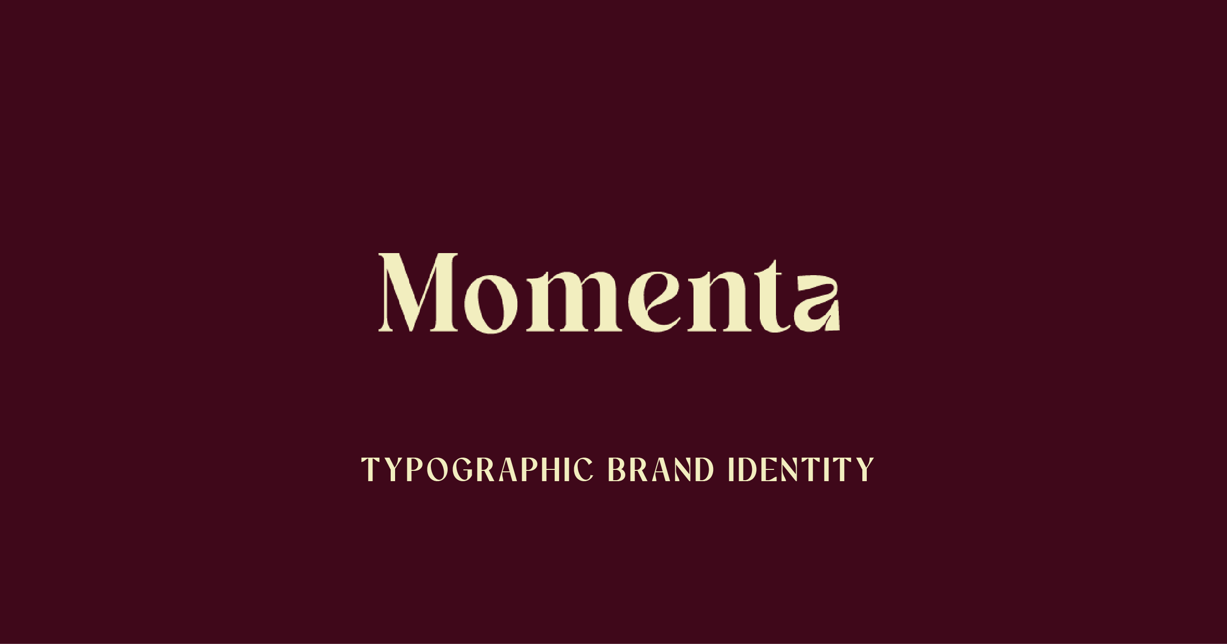
with Momenta Brand Identity
1. Overview
A brand and communication studio looking to refine their brand image, improve their visual communication and generate cohesive brand touchpoints.
2. The Challenge
The brand has a strong focus on client brand strategy and positioning, they wanted a visual identity that felt memorable, editorial, and impactful without pigeon holing them to a certain industry.
Client Brief
Looking for a typographic logo that feels structured, weighted and quietly distinctive:
• strong and anchored
• slightly editorial
• refined but not delicate
• interesting in their form, but not overly stylised or “wavy”
• confident without being loud

3. Approach
The focus was on refining the brand’s direction, aligning visual and messaging elements, and introducing a more distinctive approach to brand communication.
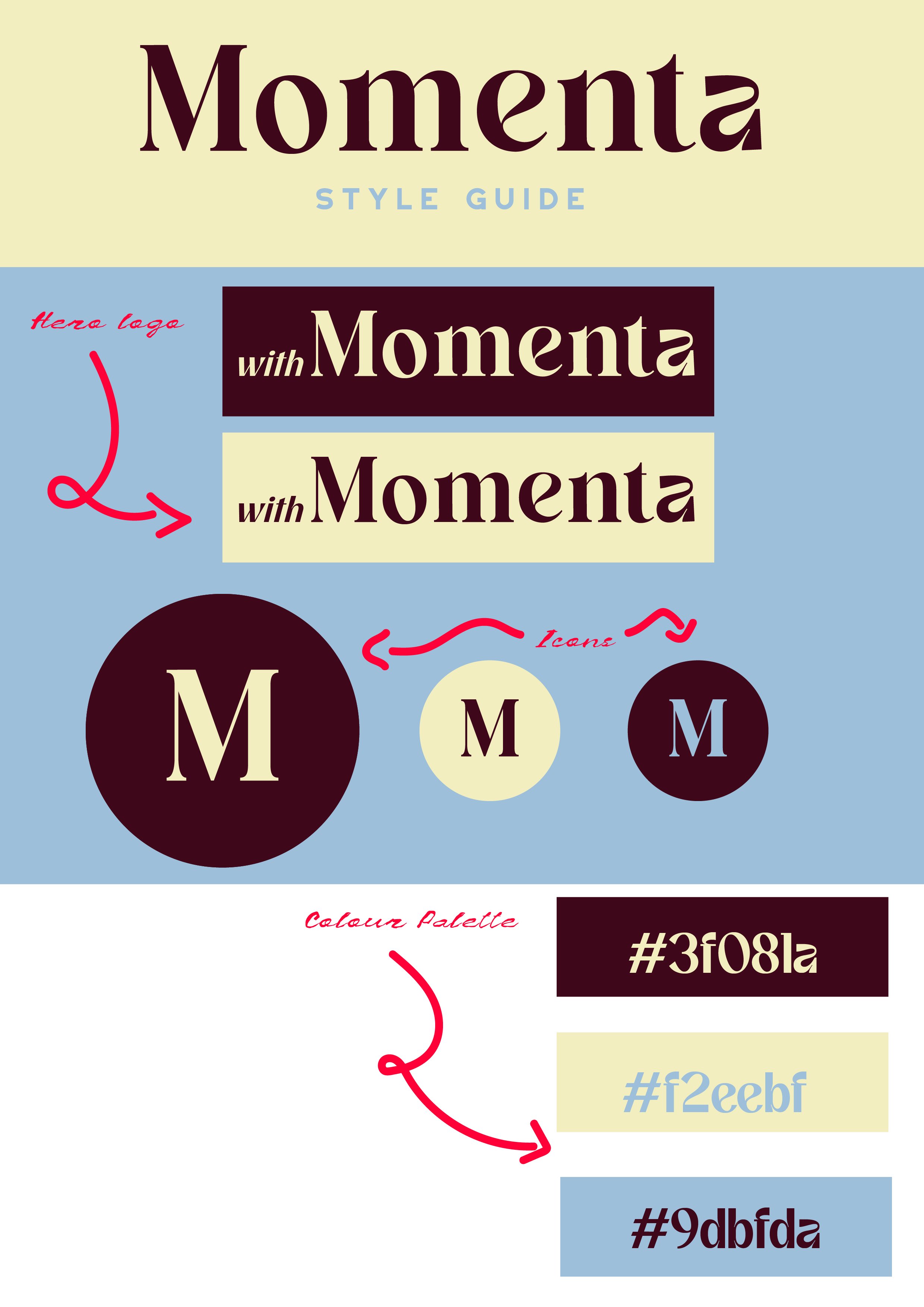
Momenta had a very specific design brief for how they wished their brand to be portrayed while still leaving room for movement and growth - to achieve this we focussed on choosing a display font that emulated as many aspects of the brief as possible, alas no sole font seemed to hit ‘interesting but not overly stylised’ but many were close. In the end two fonts were combined and tweaked slightly for personalisation to achieve the ‘Momenta’ word mark.
5. Outcome
The result was a more cohesive and confident brand, with clearer communication and a stronger foundation for future growth and room to add additional brand elements…